The following diagram illustrates a market that had been in equilibrium at (PE, QE) prior to the imposition of a price ceiling, PC. The deadweight loss that arises because of this market interventionis best described bv the area defined by:
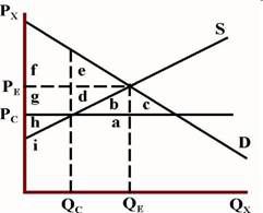
A.d+b.
B.d+e.
C.d+g.
参考答案与解析:
-
相关试题
-
Which of the following least likely describes unstable market equilibrium?
-
[单选题]Which of the following least likely describes unstable market equilibrium?A
- 查看答案
-
If a market is currently in equilibrium, which of the following is least likelyto cause an imbalance
-
[单选题]If a market is currently in equilibrium, which of the following is least li
- 查看答案
-
Which of the following best illustrates
-
[单选题]Which of the following best illustrates the relation between reason and revelation?[A] They are simply identical.[B] Revelation guides reason.[C] They are occasionally contradictory.[D] Reason is used to perfect revelation.
- 查看答案
-
[Prior] to myarrival,they had a meeting.
-
[单选题][Prior] to myarrival,they had a meeting.A.beforeB.afterC.onD.about
- 查看答案
-
the following diagram is() network topol
-
[单选题]the following diagram is() network topology structureA.busB.starC.ringD.tree
- 查看答案
-
The following diagram denotes dependency
-
[单选题]The following diagram denotes dependency between two activities A and B,It says()A.B can’t start before A is finishedB.B can’t finish before A is finishedC.B can’t start before A startsD.B can’t finish before A starts
- 查看答案
-
The IS curve illustrates which of the following relationships?
-
[单选题]The IS curve illustrates which of the following relationships?A.Direct rela
- 查看答案
-
The diagram to the below illustrates a consumer's allocation of her budget between items X and
-
[单选题]The diagram to the below illustrates a consumer's allocation of her budget
- 查看答案
-
The diagram illustrates a consumer's allocation of her budget between items X and Y. With an in
-
[单选题]The diagram illustrates a consumer's allocation of her budget between items
- 查看答案
-
Which of the following charts illustrates the opening price for each trading period?
-
[单选题]Which of the following charts illustrates the opening price for each tradin
- 查看答案
 prior to the imp")